
There are few retail brands in the UK as beloved as WH Smith and now that the Post Office has officially shat the bed as far as public perception is concerned, it remains perhaps the last bastion of wholesome, stationery-based high street dependability. This is why it completely baffles the mind it would even consider an exhaustive rebrand at a time when spirits in the UK have never been lower.
Over the Christmas break, however, the over 200-year-old company decided to trial a shocking new identity at 10 stores across the UK. When I first saw it, I genuinely thought it was a joke. That’s how bad it is.
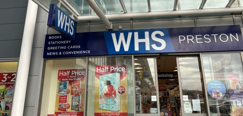
WHS Discount
Anyone who lives in the UK should be able to see the problem immediately: The new logo is almost identical to the logo that’s been used by the NHS for decades. It’s a look that’s synonymous with healthcare, not stationery. Not only that, but the identity appears to have taken the “Smith” completely out of the equation, effectively changing the brand name to just WHS.
The move could have been seen by the team behind it as a move to modernise the brand but it’s a rebrand devoid of any finesse or character that obviously had little consumer insight behind it. It’s the kind of attempt you’d expect of a GCSE graphic design student.
Thankfully, the brand immediately saw the error of their ways (or rather read the feedback online) and decided not to roll the rebrand out to the rest of their 1000+ stores in the UK.
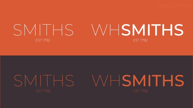
The creative community were quick to offer their own ideas, such as this one from Casey Byrne
This is the statement they issued: “With some customers telling us they aren’t always aware of the wide range of high quality, great value products we stock in our high street stores, we are testing new signage at a small number of locations, to localise our offer and highlight the key product categories customers can always find at WHSmith. This is a trial and only in ten locations. There is no plan to roll this out to the rest of the estate.”
This all begs the question; in the age of a 24-hour news cycle and social media ubiquity, is it really possible for brands to “test the waters” anymore without being privy to trial by public opinion? And in the same breath, isn’t the whole point to gauge public opinion, so perhaps the unequivocally negative pushback was, in the long run, a good thing for the brand? It’s all a bit of a farce really. It is one, however, that highlights several key lessons for businesses considering a similar path.
Understand your audience – Rebrands should always consider the preferences and expectations of your customer base above all else. Of course, you might have certain things you want to achieve with a rebrand on a more personal or practical level, but the audience should always be in the back of your mind and no audience would ever approve of WHS.
Preserve brand heritage – While modernizing a brand can sometimes be important to avoid falling behind the times, it's equally crucial to maintain a connection with the brand's history and core values. Look at iconic brands like Coca-Cola, Nike and Disney. Say what you want about the businesses themselves, but from a branding perspective, these are companies that have subtly altered over multiple decades without losing the core design fundamentals that can be traced all the way back to their origins.
Comprehensive strategy – A rebrand should always be part of a broader strategic plan, encompassing not just visual elements but also messaging and customer experience. A rebrand suggests not just a surface level change but a deeper shift in operations and what the company is trying to achieve. If you’re just rebranding because it’s been a few years and you feel like “it’s about time”, you might want to reconsider.
People Care About Brands
Of course, the situation with WH Smith is far from unique. Gap experienced an ill-fated rebrand attempt tat lasted less than a week in 2010 and when Tropicana rebranded in 2009, it led to an immediate 20% drop in sales. And let’s not even get started on the disaster that was the original London 2012 Olympics logo.
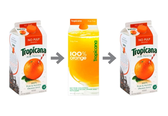
The disastrous 2009 Tropicana rebrand
What this seems to prove is that people care more about how a brand looks than you might think, particularly when it’s a brand with such a storied history. A bad rebrand can affect customer loyalty, brand value, and potentially, the company's financial performance. When rebrands go wrong, they can lead to a loss of trust as audiences feel like a part of their relationship with the brand has been chipped away.
So, let’s look at this as a cautionary tale, shall we? And never speak of it again.


Paul Roper January 20th, around noon
"stationary-based"? I think this brand isn't going ANYWHERE!